‘Responsive design’ is a term used to describe an approach to CSS oriented page design whereby the layout of the page responds to the screen-size. It is the preferred (by Google at the very least) approach for website design over having a separate mobile version. Essentially responsive design allows elements to flow/size differently as the view-port changes size. There are many responsive design tutorials on the net, and due to the scope of this article it will be assumed that the reader has at least some familiarity. This article and its code are specific to our SearchUnit product, which is a Javascript based search engine that uses HTML based templates for layouts. The templates are responsive by default, but there are some tweaks which can be made to improve the user experience (such as making it easier to touch list items). There is a complete downloadable MVC project here, which uses a very small index based on some of the web pages on keyoti.com. Note that it includes (in the web.config) a time-trial key, which may have expired, please update it as necessary). For this style of design we will specify the viewport to not scale on mobile devices using the meta tag <meta name="viewport" content="width=device-width; initial-scale=1.0"> Tweak #1: Changing the auto-complete option font size. Although the default font size is comfortably readable on a phone or small device, the auto-complete drop down options are difficult to select accurately. The solution is to define a CSS section specifically for small screen devices, using “@media” (note that because this is a Razor application the code uses @@media to escape the ‘@’ symbol, if this code were in HTML then it would read “@media…”). @@media only screen and (max-width: 400px) { /*Make autocomplete suggestions a bit easier to select on smaller screen*/ .sew_ac_results li { font-size: 1.3em; } } This makes the auto-complete list items 1.3x the size of the parent text. 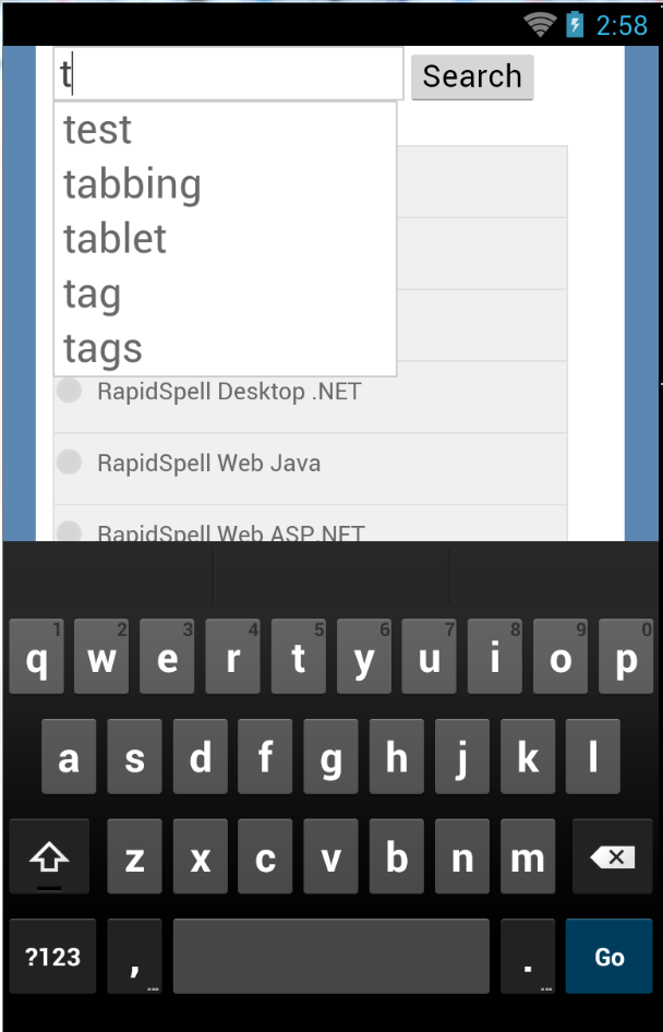
Tweak #2: Making the location/content options touchable. Similar to the auto-complete, the default input elements for the location/content options (radio and checkbox controls) are a bit too small to touch accurately. Rather than make the text bigger in this instance, we will put a box around the text with some padding. 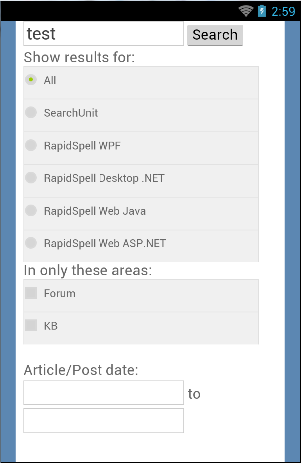
Unlike the auto-complete change, for this website we want to have the box design apply to large and small screens, so this CSS code does not go inside the @media section used for auto-complete: .sew_locationOption >span>label, .sew_contentOption >span>label { border-top: 1px solid #E0E0E0; border-left: 1px solid #E0E0E0; border-right: 1px solid #E0E0E0; PADDING: 8px 0px; MARGIN: 0px; BACKGROUND-COLOR: #F0F0F0; max-width:300px; /*For bigger screens we don't want the choosers to be too wide*/ width:100%; /*For smaller screens the width will go to 100%*/ } Tweak #3: The search result layoutWith a few minor adjustments we can optimize the width of the device a little further, to use more screen real estate. 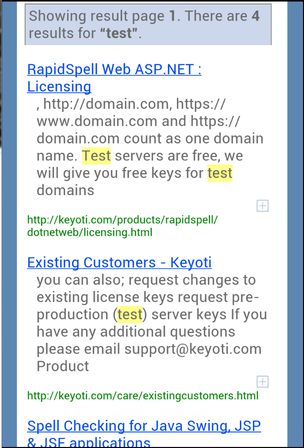
This code specifies a percentage for the horizontal margins, removes the horizontal header margins and forces the entire control to 97% width for small screen devices. .sew_resultItem { margin:20px 1%; } .sew_header { margin-left:0%; margin-right:0%; } @@media only screen and (max-width: 400px) { … #sew_searchResultControl { width:97% !important; } } Customizing furtherThe methodology used in preparing this article was to shrink down IE to about 360px wide and look at the page. Use F12 to identify elements where the styles were not ideal for small layout, and then specifying new CSS rules to adjust as necessary. Once it looks right, “Publish” the app. to a development IIS (eg. full IIS on your machine) and browse to it from an actual Android/iOS device or emulator. Sometimes it is not possible to layout using just CSS, in which case you can consult the Help section on templates, and use the code to modify as necessary. In our “Food and Recipes” demo project we used a custom layout to include images of the food in the results, which on small screens reflow to fit underneath instead of adjacent to the result text. |